
From payments to
investments
Telda's investment product aims to make stock trading feel approachable for a mobile-first generation in Egypt. The opportunity was not simply to expose users to market data, but to design an experience that helps first-time investors understand options, narrow decisions, and execute with confidence.
I focused on the end-to-end investing journey across discovery, stock selection, trading, and post-order states. The core design challenge was balancing the information density of a trading product with the clarity and reassurance needed by less experienced investors.
This gave Telda a unique advantage: an existing, trusted user base already comfortable with the app handling their money.
The Market Paradox
Massive latent demand alongside near-zero participation.
The Egyptian pound's collapse from 15.7 EGP/USD to approximately 50 EGP/USD created visceral urgency to protect savings. Yet complexity, low financial literacy, and distrust kept 98% on the sidelines.
Telda's Unfair Advantage
650K monthly active users already trusting Telda with their money
70% under 35 — the demographic most affected by inflation anxiety
70% Spaces adoption — demonstrating goal-oriented savings behavior
Completed KYC for payments — reducing onboarding friction dramatically
12+ months of established brand trust through daily payment interactions
The challenge wasn't building trust from scratch. Telda already had user trust in everyday money management. The real challenge was turning that trust — and existing saving behavior — into confident investment action, while also making the product compelling enough to attract new users and expand Telda's overall user base.
Complex product,
intimidated users
First-time investors struggle to confidently choose and execute trades because the product category is complex, terminology is intimidating, and too much information is presented before users have enough context to interpret it.
Three Interconnected Barriers
From 24 interviews across active savers, payment-only users, and competitor app users:
Competitive Landscape
Insights That Shaped the Design
UX audits across 10 regional and global platforms — from MENA-native apps to global neobanks — revealed strategic patterns that directly informed every product decision in Telda Invest.
Banking + investing in one app is the direction
Wealthsimple and N26 prove that embedded investing — directly from your bank balance, no separate funding — works at scale. N26 launched across 18 European markets; Wealthsimple passed C$100B in assets.
Standalone apps either oversimplify or overcomplicate
Robinhood's gamification drove reckless trading. Interactive Brokers' power-user complexity alienates beginners — they had to build 3 separate apps to compensate. Neither serves the bank-native beginner.
Embedded investing eliminates the biggest drop-off point
Thndr's 82% EGX market share proves Egyptian demand, but its standalone model forces separate funding and dual-app management. N26 and Wealthsimple both solved this — investing from the same balance users spend from. Telda can leapfrog Thndr by embedding investing where the money already lives.
Amount-first buying + fractional shares removes the math barrier
New investors think in money, not shares. Robinhood's "buy $20 of Apple," Stash's thematic bundles, and N26's €1 minimum all prove the same thing: hiding unit math converts hesitant users into first-time buyers. This is table-stakes now.
Progressive disclosure turns complexity into confidence
Sarwa's layered onboarding reduced UAE drop-off. Revolut uses Instagram-style story cards to explain concepts at the moment of discovery. Wealthsimple grows with users — robo-advisor first, then self-directed trading when they're ready. Start simple, unlock depth on demand.
Gamification creates reckless confidence; jargon creates paralysis
Robinhood's confetti and streaks encouraged impulsive trades — a disaster for first-time investors. Interactive Brokers went the opposite extreme: broker-centric labels, dense tables, and buried controls forced them to build 3 separate apps. Both extremes fail beginners.
Thematic grouping makes asset discovery intuitive
Stash bundles assets by interest (tech, clean energy) not ticker symbols — reaching 95% beginner investors. N26 launched "Ready-Made Funds" with BlackRock (Mindful, Balanced, Ambitious) and portfolio grouping. Telda can localize this: EGX blue chips, gold, Sharia-compliant bundles.
Education at the point of action — not in a tab nobody visits
Every competitor isolates education: Stash has a "learn" section, IBKR built a separate InvestMentor app, Sarwa has onboarding modules. Revolut's story cards come close but feel like marketing. Nobody teaches at the exact moment of decision. That's the gap.
No one bridges the trust gap between banking and investing in MENA
N26 and Wealthsimple proved the embedded model in Europe and Canada. But no MENA platform combines banking trust, localized education, and beginner-first UX. Thndr is standalone. Sarwa is UAE-focused. Stash and Robinhood are US-only. Revolut doesn't serve Egypt. Egyptian users already trust Telda with their money — that banking relationship turns "should I try investing?" from a leap of faith into a natural next step.
No MENA platform combines payments, investments and beginner-first UX in a single product. Telda Invest was designed to own that intersection, turning Telda's existing user trust into the lowest-friction entry point to investing in Egypt.
Two personas,
one product
Two distinct personas emerge from Telda's user base — each requiring different product experiences within the same app.
- Protect savings from inflation
- Build toward life goals (apartment)
- Feel responsible about the future
- Losing what little she has
- Looking stupid / making mistakes
- Not understanding terminology
- Profit from market movements
- Beat the market through skill
- Consolidate fragmented tools
- Missing big moves
- Platform failures at critical times
- Fees eating into profits
User Readiness Segments
Aligning user needs
with business goals
| User objective | Business objective | Design objective |
|---|---|---|
| Understand what to invest in | Increase discovery → first trade conversion | Reduce ambiguity in discovery |
| Feel confident before buying | Reduce drop-off in trading funnel | Make key information easier to interpret |
| Execute with less friction | Improve completion of buy/sell flows | Shorten path from intent to action |
| Track what happened after submitting | Increase retention and perceived reliability | Clarify order states and next steps |
Key Insights
These insights connect behavior to product implications:
Users are not only choosing stocks; they are evaluating whether they trust themselves enough to act.
For beginners, raw financial data does not automatically create clarity. In many cases, it increases hesitation.
Open-ended discovery feels powerful to experienced traders but overwhelming to new investors.
Jargon-heavy interfaces create an expertise gap and make users fear making a mistake.
The highest-leverage design move is not adding more content; it is sequencing the right information at the right moment.
Order and portfolio states matter because they complete the trust loop after the user commits money.
Five principles that
shaped every screen
Guide, don't dump
Use curated entry points and guided narrowing rather than forcing users into a blank discovery state.
Reduce cognitive load
Group information into layers and rely on progressive disclosure instead of showing every metric at once.
Support decisions, not only navigation
Surface context that helps users compare, shortlist, and understand why an option may matter.
Compress the path to action
Remove unnecessary distance between insight, intent, and trade execution.
Close the trust loop
Use order review, status, and portfolio states to reassure users about what happened and what comes next.
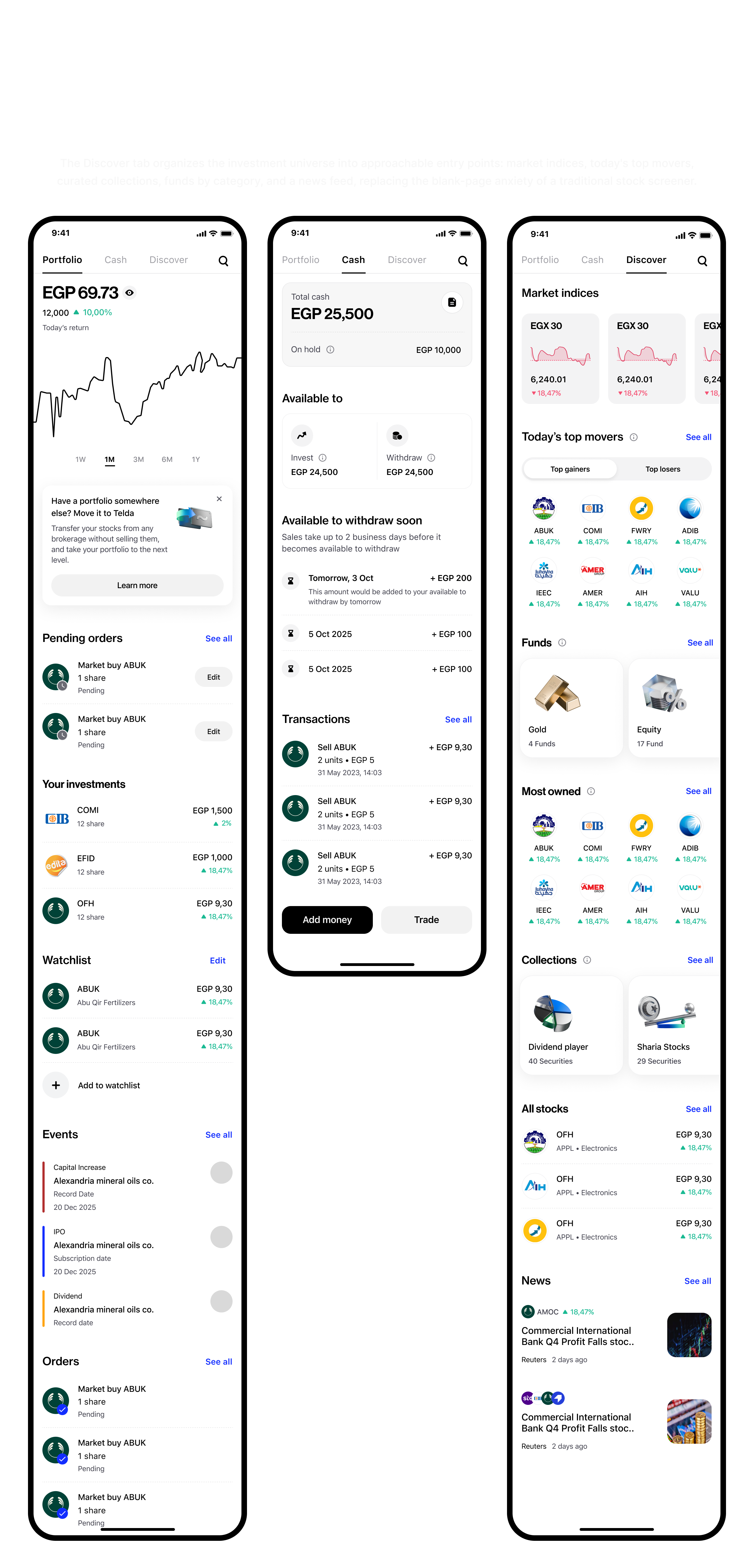
From discovery to
confident action
Discovery that gives users a starting point
The discovery experience should not behave like a professional terminal. It should help users begin. Curated collections, thematic groupings, and structured entry points reduce blank-page anxiety and make the product feel more approachable.
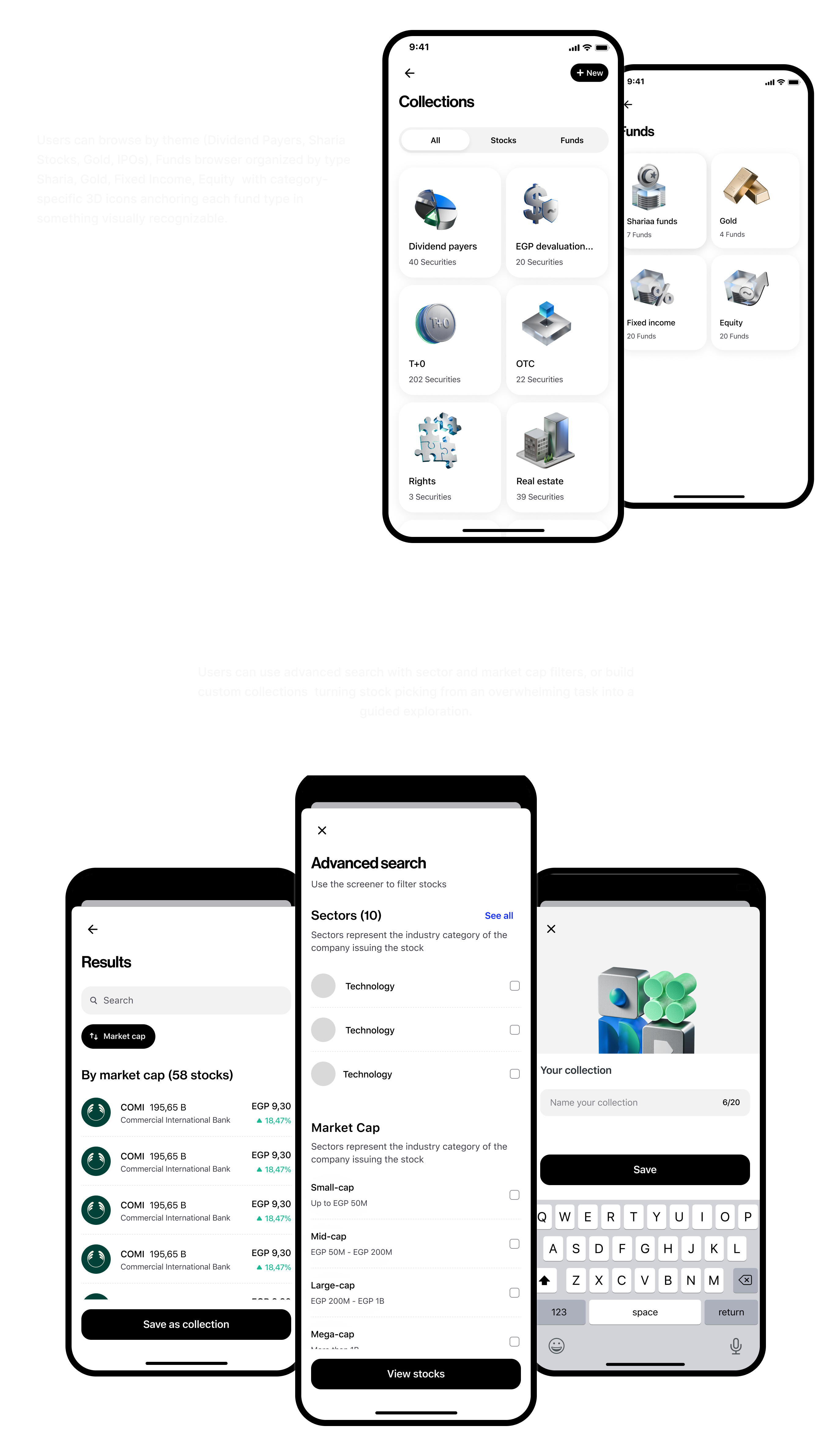
Filtering that narrows choices without overwhelming
Advanced filters are useful, but they should feel like controlled narrowing rather than a wall of parameters. Sector, market cap, and other criteria are most valuable when introduced progressively and tied to understandable selection outcomes.
Details pages that build confidence before action
Stock and fund detail pages should translate complexity into confidence. That means emphasizing a clear hierarchy, showing the most important decision inputs first, and deferring niche data until users actively seek it.
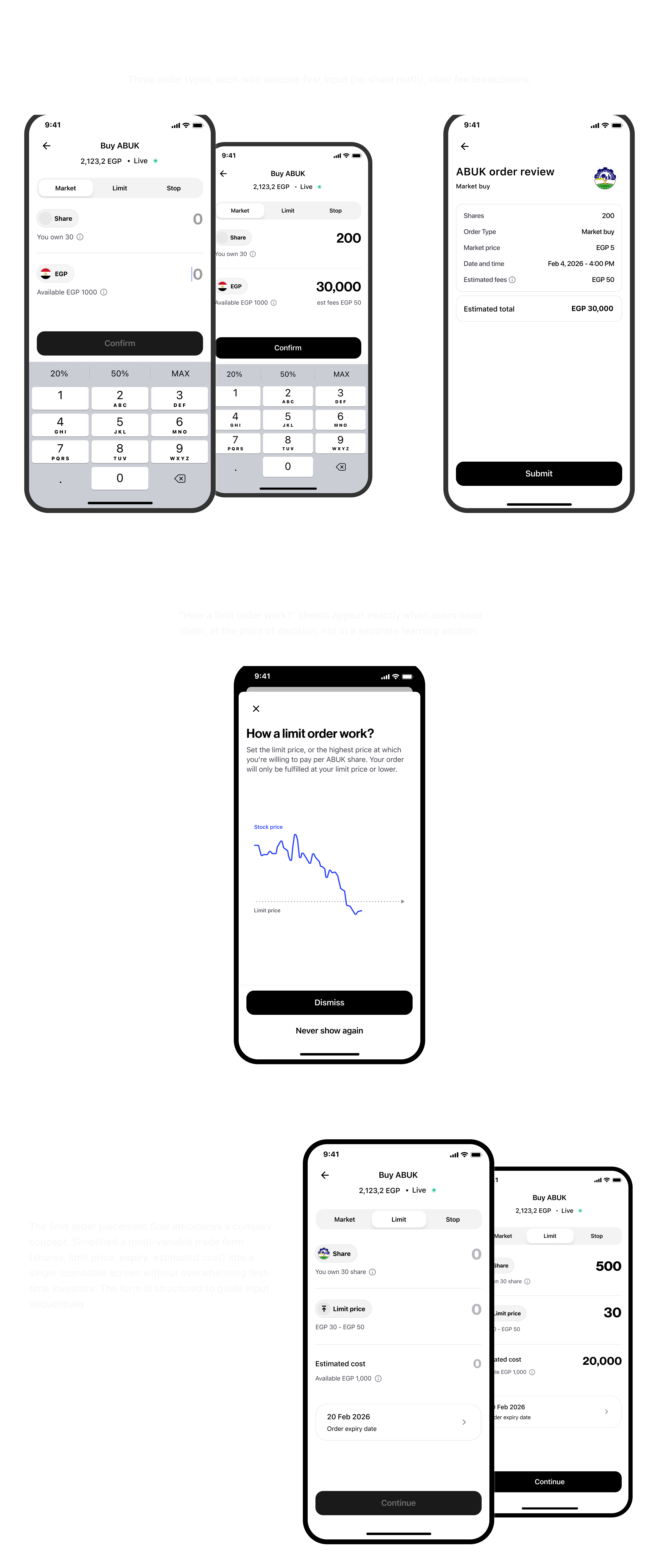
Trading flows that preserve momentum
Buy and sell journeys should feel deliberate but not heavy. The goal is to validate critical choices, reveal consequences clearly, and avoid last-mile drop-off.
Post-order states that complete the experience
Order review, order status, editable states, and portfolio feedback are not secondary screens. They are where the product proves reliability and keeps users oriented after execution.
Two weeks of data,
strong early signal
Launched to 100,000 users on March 10, 2026. Two weeks of data reveal strong performance with one critical friction point.
Funnel Performance
Critical Finding: NTRA Verification
70% of users who started onboarding failed NTRA verification — phone number not matching national ID registration. This is a regulatory constraint, not a UX problem. Leading two mitigations: pre-check flow before onboarding and alternative verification paths.
Deep-Dive on Each Metric
Each estimate is reasoned from the funnel, the deposit model, and persona behavior.
~78% Of 9K verified → ~7,000 deposit
The wallet transfer is a psychological commitment — "I'm setting money aside for investing." ~22% hesitate: some browse post-verification without intent, some get cold feet at the amount screen, some plan to "come back later" and don't. This is the second friction point after verification — less obvious but real.
~86% Of 7K depositors → ~6,000 trade
The deposit is the real commitment. Money sitting in an invest wallet has clear intent — users don't transfer just to look. The 14% gap: decision paralysis (too many options), market-hours confusion (trying to buy outside EGX hours), or "waiting for the right time" — a classic beginner behavior.
~1% Of 9K verified → ~90 users
Target persona = first-time investor. Most have no portfolio. The small slice is Thndr users wanting to consolidate EGX positions. Portfolio transfers need broker paperwork and settlement — outside Telda's control. This is a 6-month growth metric, not a launch KPI.
~30–40% vs. industry avg 40–55% drop-off
Amount-first = no share-math confusion. Contextual education at the decision point reduces "I don't understand this" abandonment. Remaining drop-off is mostly browse-only behavior — users viewing stock details as research, not with immediate buy intent.
72% saw · 18% invested Of ~6K active investors
High visibility, moderate conversion: Collections (Gold, Sharia, Egyptian Tech) are prominent — most users see them. But beginners pick one familiar stock first before trusting a curated bundle. 18% (~1,080) is healthy for week 2. Expect 28–35% by week 6 as users seek diversification.
~82% Tapped "Buy" → order confirmed
18% drop-off splits between: insufficient invest-wallet balance (~9%) — deposited less than needed, market-hours confusion (~5%) — buying outside EGX hours hits a blocker, and last-second hesitation (~4%) — first-timers second-guessing on the confirmation screen. Well above fintech industry avg of 65–75%.
What worked,
what I'd change
Progressive simplicity > progressive disclosure
For low-literacy audiences, hiding complexity behind toggles isn't enough. Start radically simple. The 89% first trade completion rate validates this approach.
Cultural anchors accelerate adoption
Gold required zero education because it carries cultural trust. 67% of first trades being gold wasn't a limitation — it was the strategy working exactly as designed.
Existing trust compounds
Telda's payment users converted at rates impossible for a standalone app. The 4-screen KYC upgrade was only possible because of pre-existing data and trust.
Earlier regulatory edge-case discovery
The NTRA verification issue should have been caught in research. I focused on UX friction I could control and didn't dig deeply enough into the regulatory verification layer.