Understanding
ThndrX Today
ThndrX is Thndr's professional-grade desktop trading platform, launched in May 2025, targeting active traders on the Egyptian Stock Exchange (EGX). It sits alongside Thndr's mobile app (built for simplicity) and Thndr Alpha (guided investing for beginners). ThndrX occupies the "pro" tier — a paid feature within the Thndr Trader subscription (EGP 245/month).
Current Architecture
Widget-based modular workspace — users can move, resize, and color-link widgets together so selecting a stock in Market Watch auto-updates Chart and Order Execution
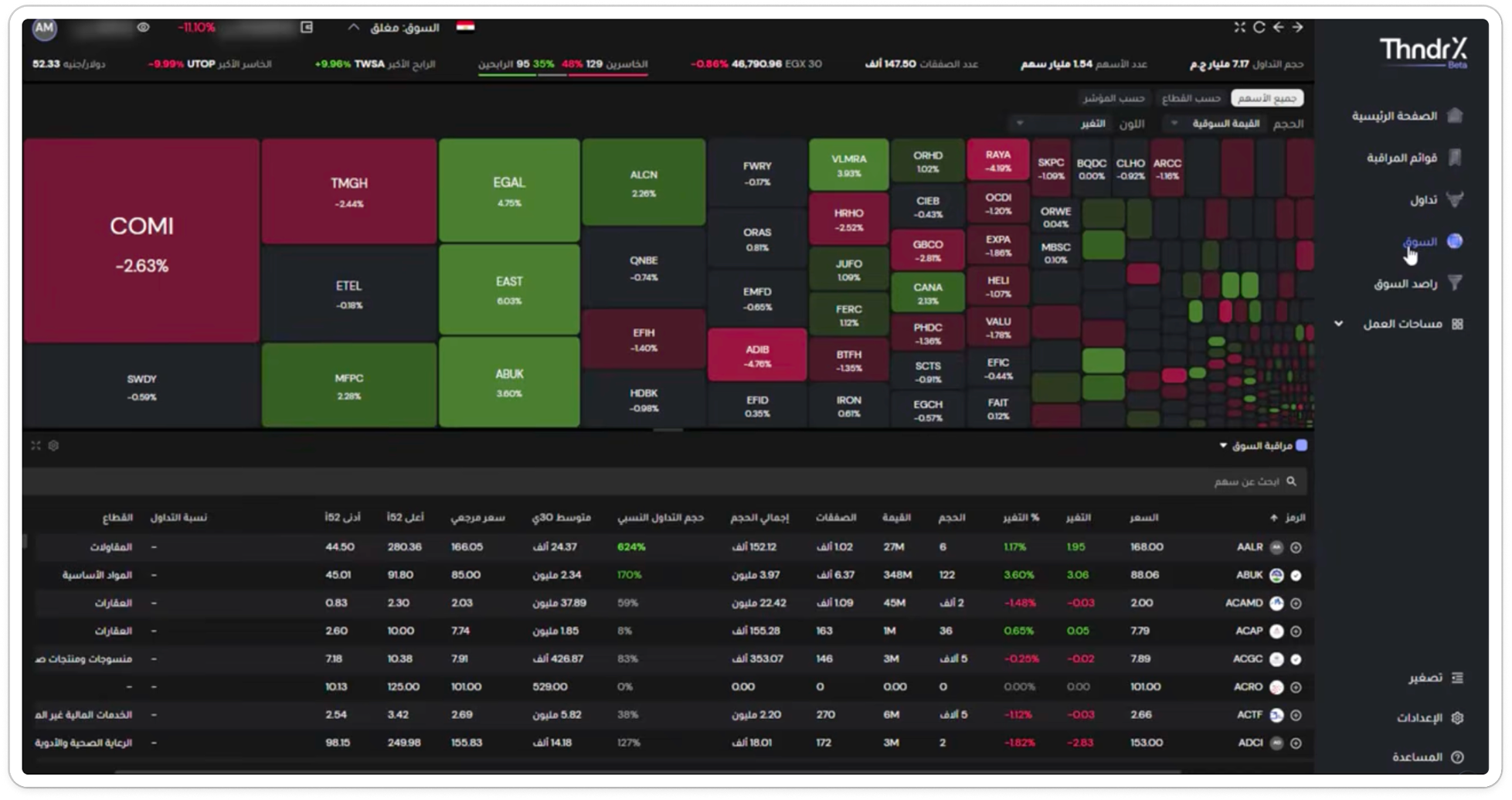
Three preset tabs with a right sidebar navigation showing: الصفحة الرئيسية (Home), قوائم المراقبة (Watchlists), تداول (Trading), السوق (Market — currently active), راصد السوق (Market Monitor), and مساحات العمل (Workspaces)
Desktop-first requirements: Windows 10+ / macOS 10.14+, 1080p minimum resolution, 8GB RAM — defining the safe design area at 1920×1080
ThndrX is about “respecting the craft” of trading. The platform’s identity is speed, precision, and control — not gamification. The Market Landing Page should feel like an instrument panel, not a consumer dashboard.
What the Market
Tab Does Today
Based on a direct review of the ThndrX Market tab (Beta), I mapped every existing element to identify what works, what's missing, and what the redesign should prioritize.
The Missing Pieces
The current Market tab gives traders the "what" — what's moving and by how much. The redesign adds the "why" (news), the "when" (calendar), and the "how much context" (richer index and global benchmark data).
No Index Summary Module
EGX 30 is compressed into the ticker bar. EGX 70 and EGX 100 are completely absent. No intraday spark lines or session high/low for indices.
Only One Global Benchmark
No Gold, Oil, S&P 500, or EUR/EGP. Egyptian traders closely monitor these for macro context — only USD/EGP is shown.
No Session Timer
Traders can't see how much time remains in the 4.5-hour session at a glance. Only a static "open/closed" status badge exists.
No News Section
If a stock moves +9.96%, there's no way to understand why without leaving the platform. Context is completely absent.
No Market Calendar
No upcoming IPOs, earnings, dividends, or stock splits visible. Forward-looking context is missing entirely.
What Works Well (Keep or Evolve)
Treemap heat map — size-by-market-cap, color-by-change is industry standard and well-executed. Enhance with sector grouping borders and hover detail cards.
Pink/magenta for losses — a deliberate brand choice that creates visual identity. Preserve the semantic color palette.
Market breadth bar (35% gainers / 48% losers) — smart, compact sentiment indicator. Deserves more visual weight in redesign.
Filter architecture on the heat map (by index, by sector, sort by cap/change/intensity). Enhance with additional grouping options.
Ticker search — essential. Keep it, and consider making it global (searchable from any module).
What I Learned &
How It Shaped My Design
I studied three leading global trading platforms to understand how they handle market overview, data density, and trader workflows on desktop — then adapted each insight for ThndrX's single-exchange, short-session EGX context.
Market Overview Should Be a Single Scannable Surface
Moomoo combines global indices, commodities, forex, bonds, and crypto on one scrollable surface with compact cards showing value, change, and spark lines. Their Canada page uses three large index cards with embedded area charts at the top.
Heat Maps Need Sector Grouping to Be Actionable
Moomoo’s sector-labeled heat map uses clear borders between clusters, each with aggregate change percentages. Block sizes cascade from dominant tickers to tiny pixel blocks — a convention traders already understand.
Market Watch Tables Need Strategy-Oriented Views
Instead of a single flat table, Moomoo splits into Top Gainers, Top Losers, Heat List, and High Dividends — ranked lists with numbered rows (#1, #2, #3) making significance immediately clear.
Data Density Is the Feature, Not the Problem
Moomoo fits index cards, four ranked tables, a sector heat map, AND a detail sidebar on a single 1920×1080 viewport. Nothing scrolls on the main layout — each section scrolls internally. Professional trading platforms treat density as a feature: more data visible = fewer clicks = faster decisions.
Competitive Insights → My Design Decisions
| Insight | Source | My Design Decision |
|---|---|---|
| Index cards with spark lines | Moomoo markets overview | EGX 30/70/100 cards with embedded spark lines |
| Sector-labeled heat map | Moomoo Canada market | “By sector” grouping with watermark labels |
| Strategy-oriented tabbed lists | Moomoo Gainers/Losers split | Tabbed Market Watch (Gainers/Losers/Active) |
| Stock-tagged news | IBKR / Webull news section | Cross-module stock tags + thumbnail images |
| Week-view earnings calendar | Moomoo Earnings Calendar | Date-grouped timeline with timing details |
| Density-first single viewport | All three platforms | Three-zone layout, no main-page scroll |
Who We're
Designing For
ThndrX targets active EGX traders — the serious, paying subset of Thndr's 880K+ user base. I mapped four distinct archetypes based on their trading strategies and how they use the Market page differently.
- See top gainers/losers updating in real-time
- Fast click-through from Market Watch to order placement
- Volume spike indicators to confirm breakout validity
- Market Watch + Heat Map (top movers)
- Sector-grouped heat map with clear visual boundaries
- Sector performance comparison at a glance
- Global benchmarks for macro rotation signals
- Heat Map (grouped by sector) + Global Benchmarks
- Instant news feed with stock-tagged articles
- Economic calendar with earnings and IPO dates
- Cross-reference price moves with news events
- News Feed + Calendar + Market Watch
- Quick visual scan of market conditions in under 5 seconds
- Spark lines in Market Watch for intraday patterns
- One-click navigation from Market to Trading tab (linked widgets)
- Heat Map → Trading tab (linked widget)
Guiding the
Redesign
Three principles derived from research, competitive analysis, and understanding of EGX trader behavior. Each principle maps directly to design decisions throughout the case study.
Glanceable First, Deep on Demand
Every module has two states: a headline state (compact, scannable in 3 seconds) and an expanded state (detailed, interactive). The default view should fit on one 1080p screen with minimal scrolling.
Active traders spend 5–10 minutes on pre-market prep scanning before the session opens. The surface layer serves this prep scan; the detail layer serves in-session analysis.
Time-Aware Interface
The page adapts its emphasis based on market state. Pre-open: news and calendar expand, global benchmarks highlight overnight moves. Market open: heat map and movers dominate with live countdown. Post-close: end-of-day summary surfaces, calendar shows next session's events.
No major competitive platform does this well. It's a differentiation opportunity and signals product-level thinking beyond visual design.
Your Strategy, Your Workspace
The platform supports the trader's own strategy rather than prescribing one. Every module offers filtering, sorting, and customization. The heat map groups by user choice (sector, index). Market Watch shows user-defined segments alongside default views. News can be filtered by sector or stock.
TradingView's success is built on this principle. Pro traders reject opinionated defaults that don't match their workflow. The right default is a smart starting point, not a cage.
The Three-Zone
Model
The page is organized into three horizontal zones, each mapped to the trader's 5-question decision sequence. On a 1080p screen, Zone A is always visible, Zone B dominates, and Zone C is accessible with minimal scroll.
The Morning Decision Flow
Thinking in Scan Time
The page should reduce uncertainty in layers. I used a timing framework to decide what goes where and how much space each section deserves.
The 5-Second Read
Market status (open/closed), whether indices are up or down, general tone of the session. This is the overview layer — fast-read, top-of-page content.
The 30-Second Scan
Strongest sectors and breadth, top movers, where activity is concentrated. This is the opportunity layer — where the user scans for where to act.
The 2-Minute Deep Dive
Which catalysts matter, what events are upcoming, which symbol to open next. This is the context layer — it explains or anticipates movement.
IA Decision Framework
Nine principles guided how I structured the page — from hierarchy to density to what stays persistent versus what is switchable.
Local-first hierarchy — because this is ThndrX, local EGX indices come first, global context second. The brief emphasizes EGX 30/70/100 while global benchmarks are supporting context, not the main stage.
Persistent vs. switchable — some information stays always visible (market status, top bar, main navigation). Other content switches via filters (heatmap filters, movers tabs, news filters). Rule: persistent = orientation, switchable = exploration.
Every module needs a next step — Heatmap: click tile to open symbol. Market Watch: open chart or add to watchlist. News: open related ticker. Calendar: inspect event. If a section has no clear next action, it may be too passive.
Density through chunking — a desktop trading platform should allow high information density, but density only works when content is chunked clearly. Gainers/Losers/Most Traded become one module with tabs, not three separate blocks.
Exploration in trading starts with reading the market, not reading articles. If the page makes news too big or calendar too dominant, the hierarchy becomes weaker. Market pulse, heatmap, and market watch get prime real estate. News and calendar support.
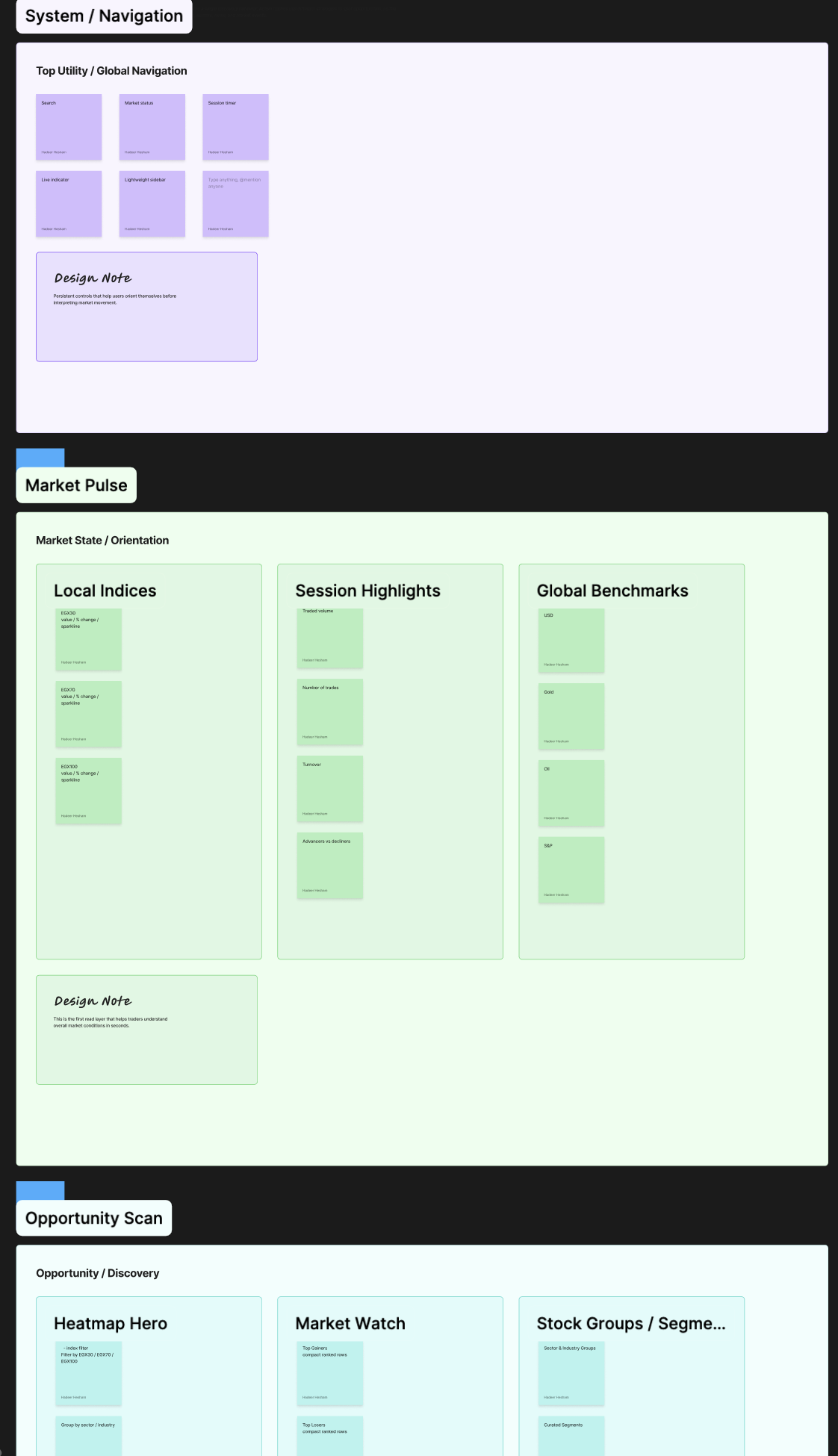
Market Pulse — The Command Bar
~120–140px heightGives the trader a complete market orientation in under 5 seconds. The current single-row ticker bar evolves into a two-row command bar with session countdown timer, all three EGX indices with spark lines, and global benchmarks (USD/EGP, Gold, Oil, S&P 500, EUR/EGP).
Market Activity — The Workspace
~500–550px heightHelp traders scan for opportunities. The current vertical stack evolves into a side-by-side layout: Heat Map (~60% width) as the primary visual scanner, and Market Watch (~40% width) with tabbed lists (Gainers, Losers, Most Traded, Sectors, Custom).
Market Intelligence — The Context Layer
~250–300px heightAnswers "why?" and "what's next?" — the biggest gap in the current Market tab. News Feed (~60% width) with stock-tagged articles and sector filters, plus Market Calendar (~40% width) showing earnings, dividends, IPOs, and stock splits.
Building the
Decision Cockpit
Each module is designed with a clear UX rationale, key decisions documented, and alternatives considered. Every design choice traces back to a research insight or documented trader behavior.
Market Pulse: Session Status & Command Bar
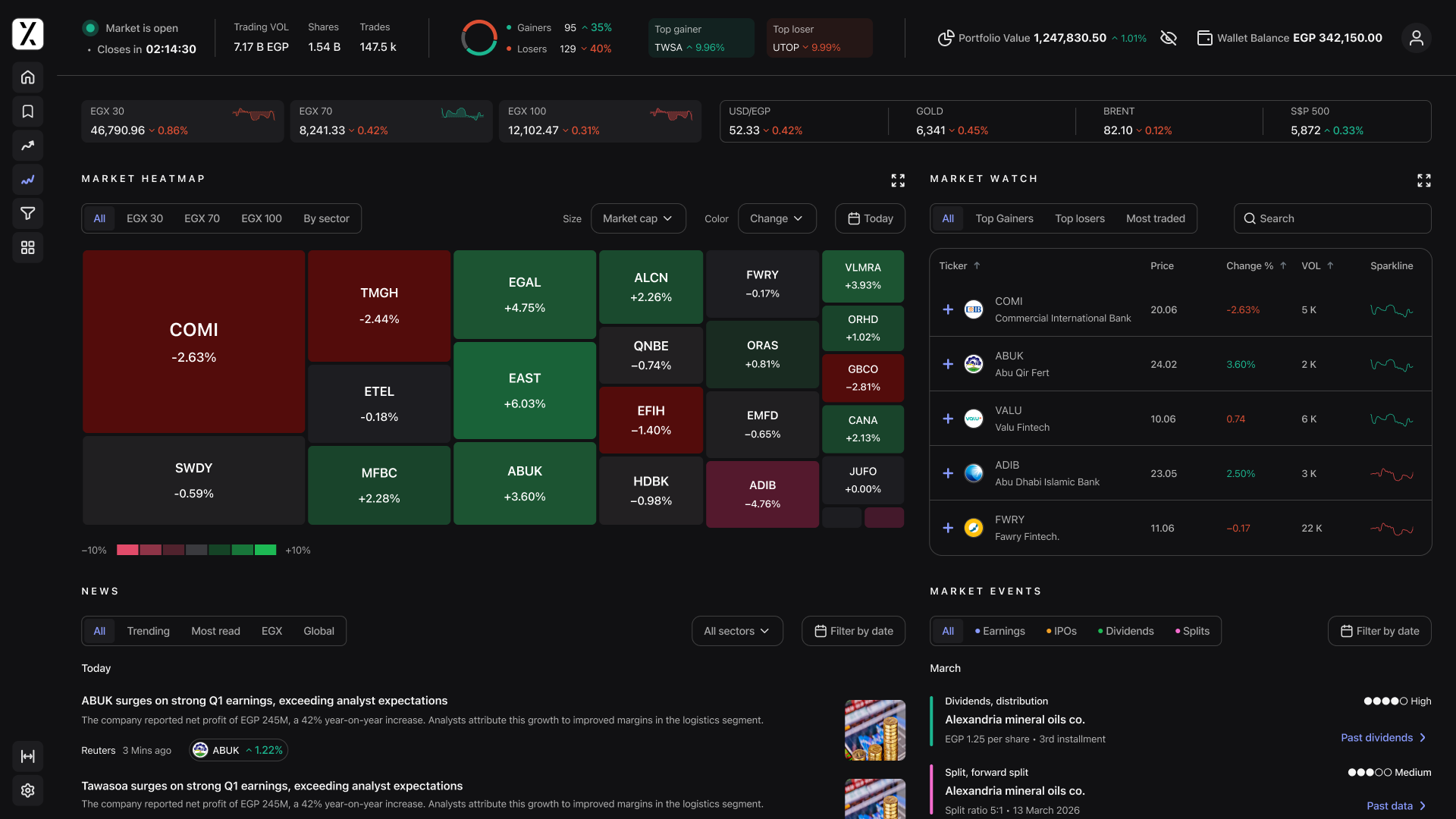
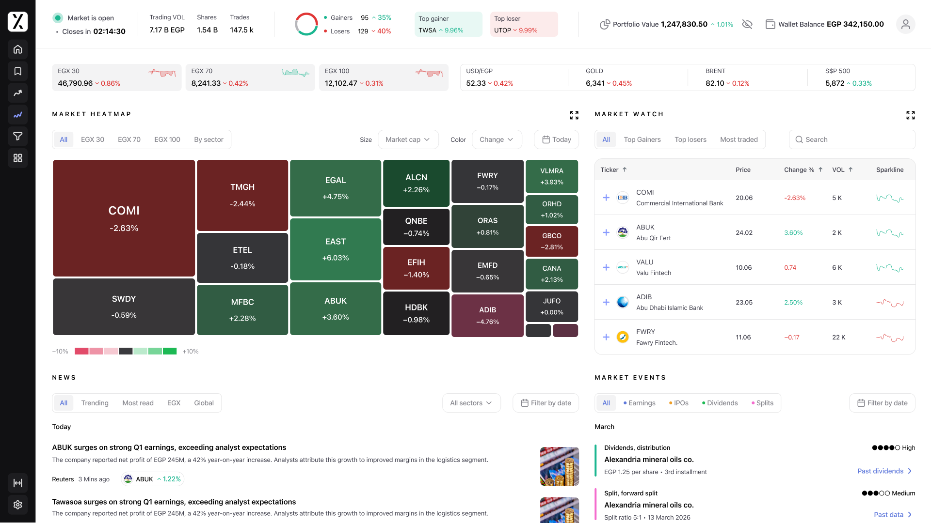
The current single-row ticker bar evolves into a two-row command bar — giving traders complete market orientation in under 5 seconds.
Countdown timer — the EGX session is 4.5 hours. Creates urgency awareness and helps traders plan execution. The closing auction has a random close between 2:23–2:25 PM, making precise timing critical.
All three EGX indices with value, % change, directional indicator, and mini spark line. Current platform only shows EGX 30 — traders can now compare blue-chip (30) vs. mid-cap (70) momentum at a glance.
Global benchmarks strip — USD/EGP first (currency risk is the #1 macro concern), plus Gold, Brent Oil, S&P 500, and EUR/EGP. Each shows value + % change with color coding.
Market breadth bar with enhanced prominence — visual win/loss ratio showing session conviction, not just direction.
Tabbed Market Watch
The current flat alphabetical table evolves into a tabbed list interface, letting different trading strategies surface immediately.
Tabbed navigation — Top Gainers, Top Losers, Most Traded, Sectors (summary cards), and Custom (user-defined watchlist segments).
Mini spark lines per stock row — shows intraday price movement without needing to open a chart.
Add to watchlist button on hover — an "Add to watchlist" action appears on row hover for quick list management.
Key Design Decision
Why side-by-side layout instead of stacked? The current vertical stack pushes the table below the fold on smaller screens. A side-by-side layout keeps both the visual (heat map) and analytical (table) view in the same viewport. At 1920px: ~1150px heat map + ~700px Market Watch + ~70px sidebar.
Market News Feed
Currently completely absent from ThndrX. This module answers "why?" — connecting price moves to the information that drives them.
Card format — headline (bold), summary snippet (2 lines max), timestamp ("10 min ago"), and source badge with recognized logos for credibility.
Filter tabs — Trending, Most Read, EGX-specific, Global macro, and filter by sector. Matches the EGX 11-sector structure.
Stock tagging — news items tagged with relevant tickers. Clicking a tag redirects to the stock page, creating a seamless "why is this moving?" → "let me see the full picture" flow.
Internally scrollable — the feed scrolls within its container without affecting the rest of the page layout.
Market Calendar
Also absent from current ThndrX. This module answers "what's next?" — giving traders forward-looking context for planning.
"Next 7 Days" default view — compact timeline showing upcoming events. Traders plan week-to-week, not month-to-month.
Color-coded event badges — Earnings (blue), Dividends (green), IPOs (yellow), Stock Splits (purple) for instant visual parsing.
Expand interaction — clicking "View full calendar" opens a monthly overlay. Each event row shows date, company ticker + name, and event type badge.
Key Design Decision
Why news and calendar at the bottom, not a sidebar? A sidebar would compress headlines and calendar data into a narrow column. Bottom placement follows cognitive flow: scan the market first (Zones A + B), then look for context (Zone C). During closed hours, Zone C can expand upward as Zone B becomes less urgent.
Complete Market Landing Page
All five modules working together in a cohesive layout at 1920×1080. The three-zone model in action.
Ideas I Didn't
Get to Yet
Given more time, these are the enhancements I'd love to explore further — ideas that emerged during the research and design process but didn't make it into the current scope.
Enhanced Heat Map Interactions
The treemap is already well-executed. These enhancements would take it further with richer interactivity and more contextual information.
Sector grouping with borders — when active, draw subtle borders between sector clusters and label each sector for instant visual hierarchy.
Hover detail card — floating card with full company name, last price, % change, volume, sector, and 52-week range mini bar. Reduces dependency on the table below.
"Halted" state — stocks hitting the ±10% daily limit show a pulsing border or diagonal stripe pattern. Traders immediately identify circuit-breaker situations.
Time-range selector — view the heat map for Today, 1 Week, 1 Month, or YTD. Currently only daily change is available.